Michaela Kappes
aka mika
Contact
kappes.michaela@gmx.de
Explore
the forbidden garden
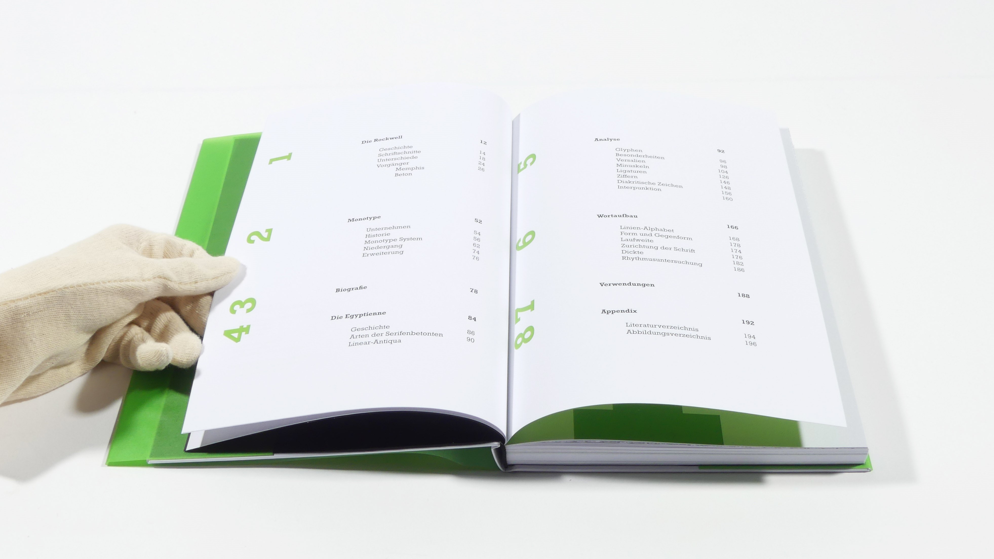
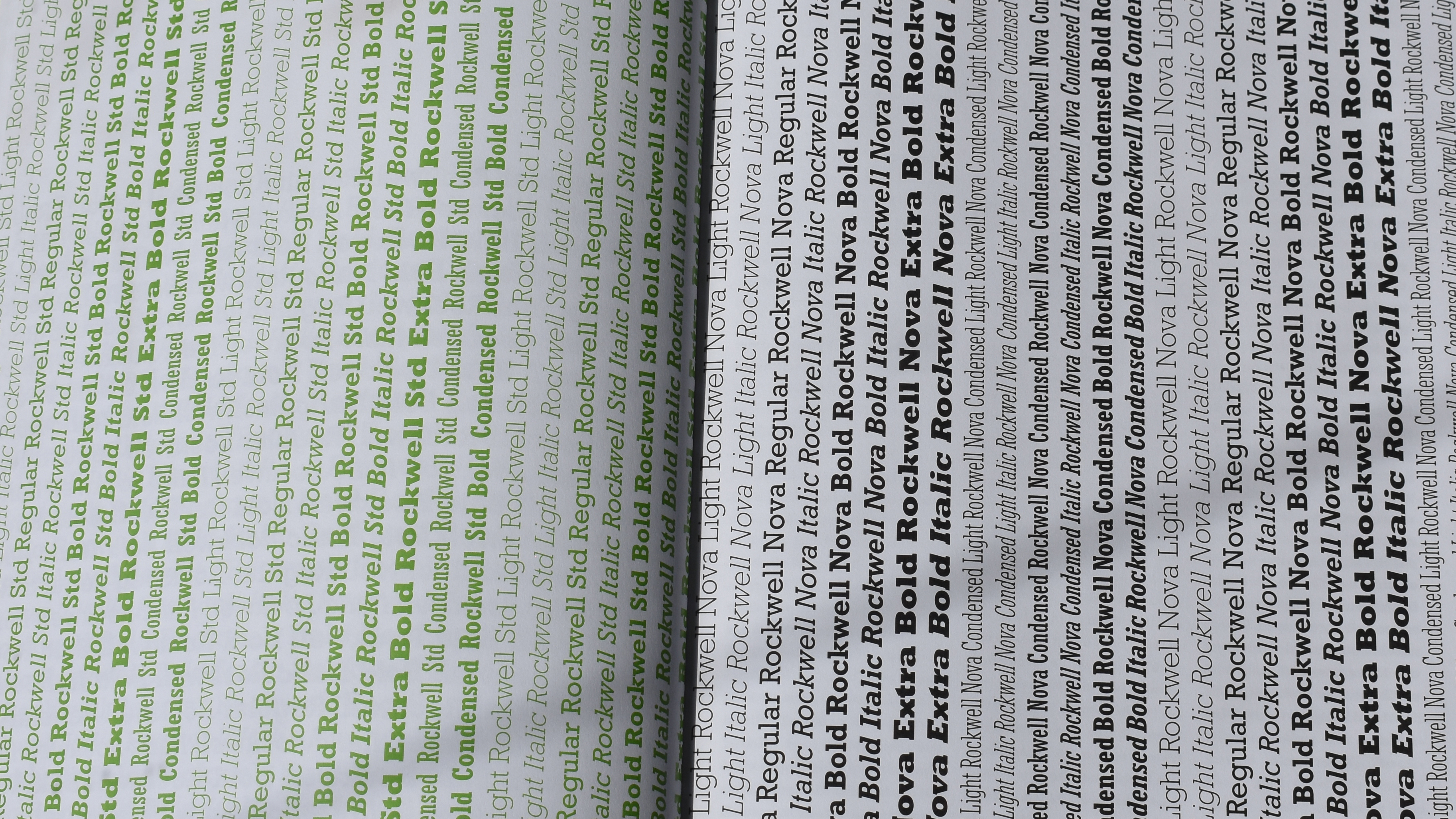
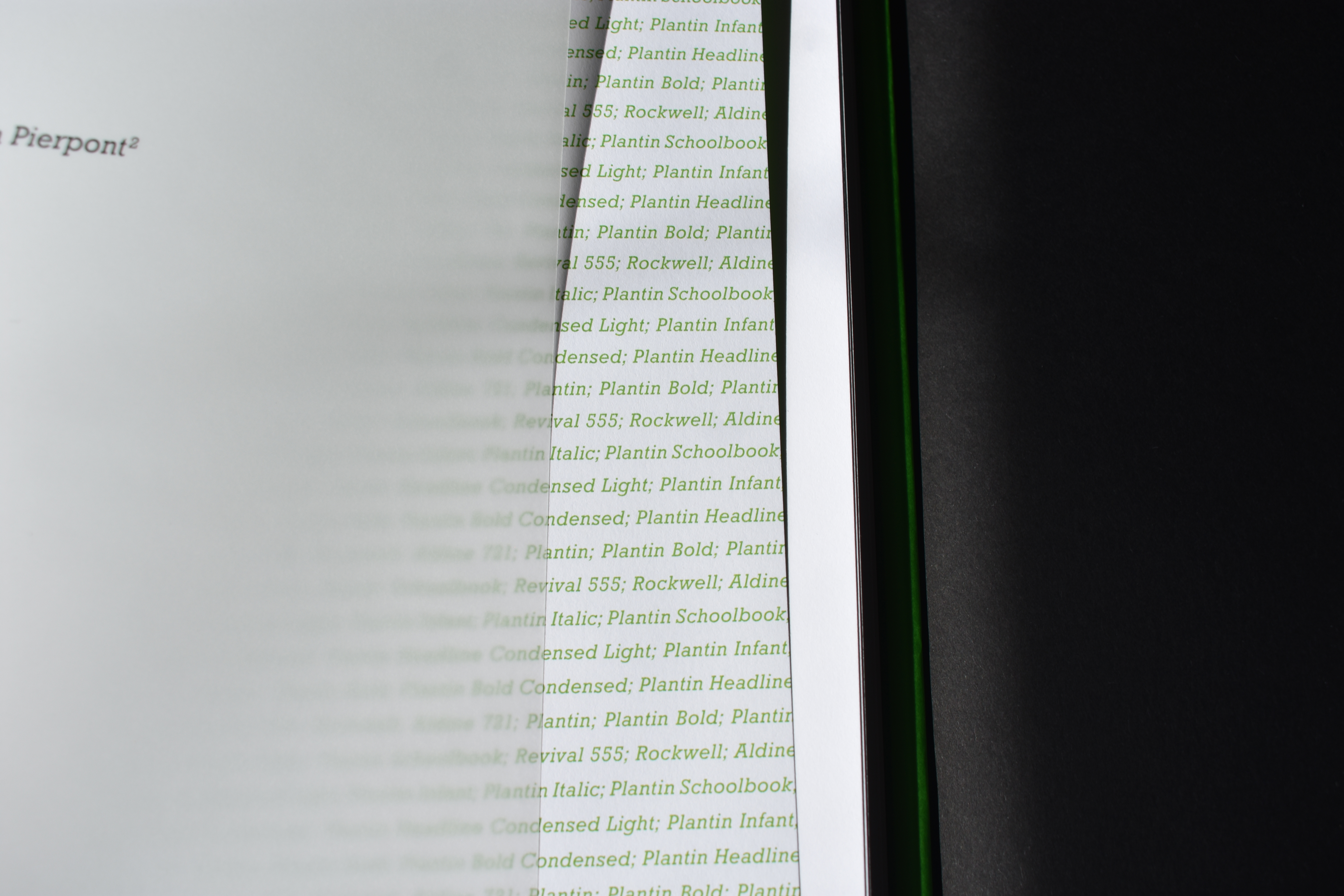
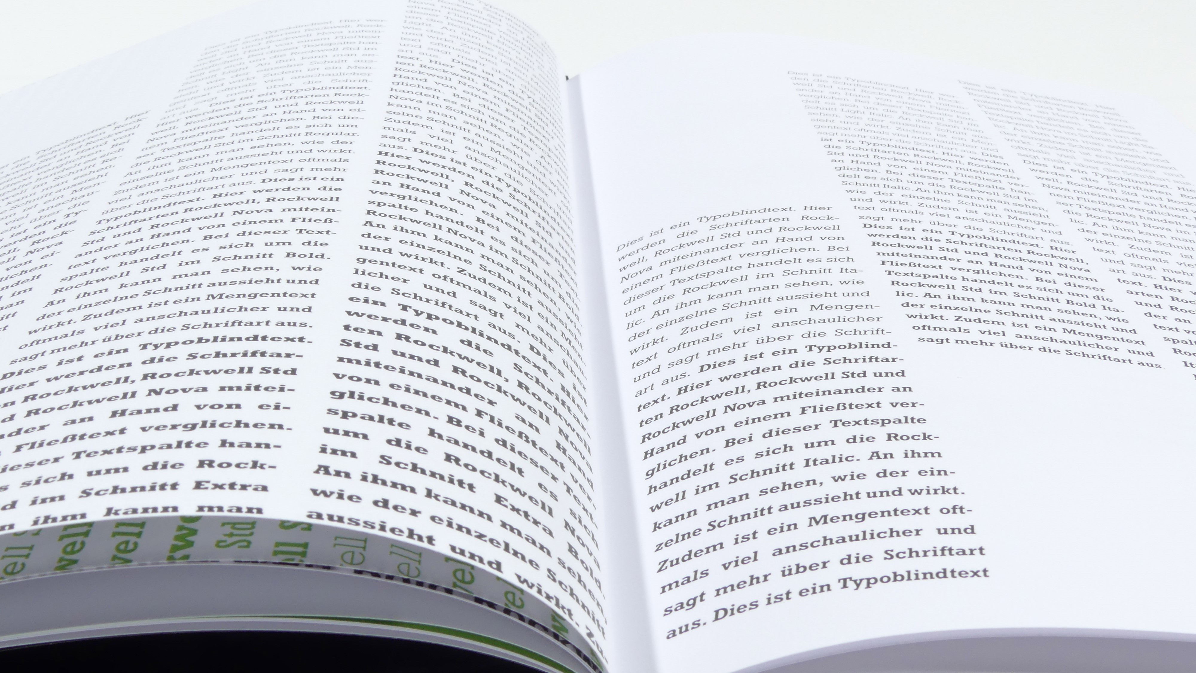
The book project is on the one hand an in-depth analysis of Rockwell, and on the other hand it provides background knowledge, for example on the history of serif linear antiqua typefaces, to which Rockwell belongs, as well as historical information on the traditional typeface manufacturer Monotype, where the Rockwell typeface was designed by Frank Hinman Pierpont.
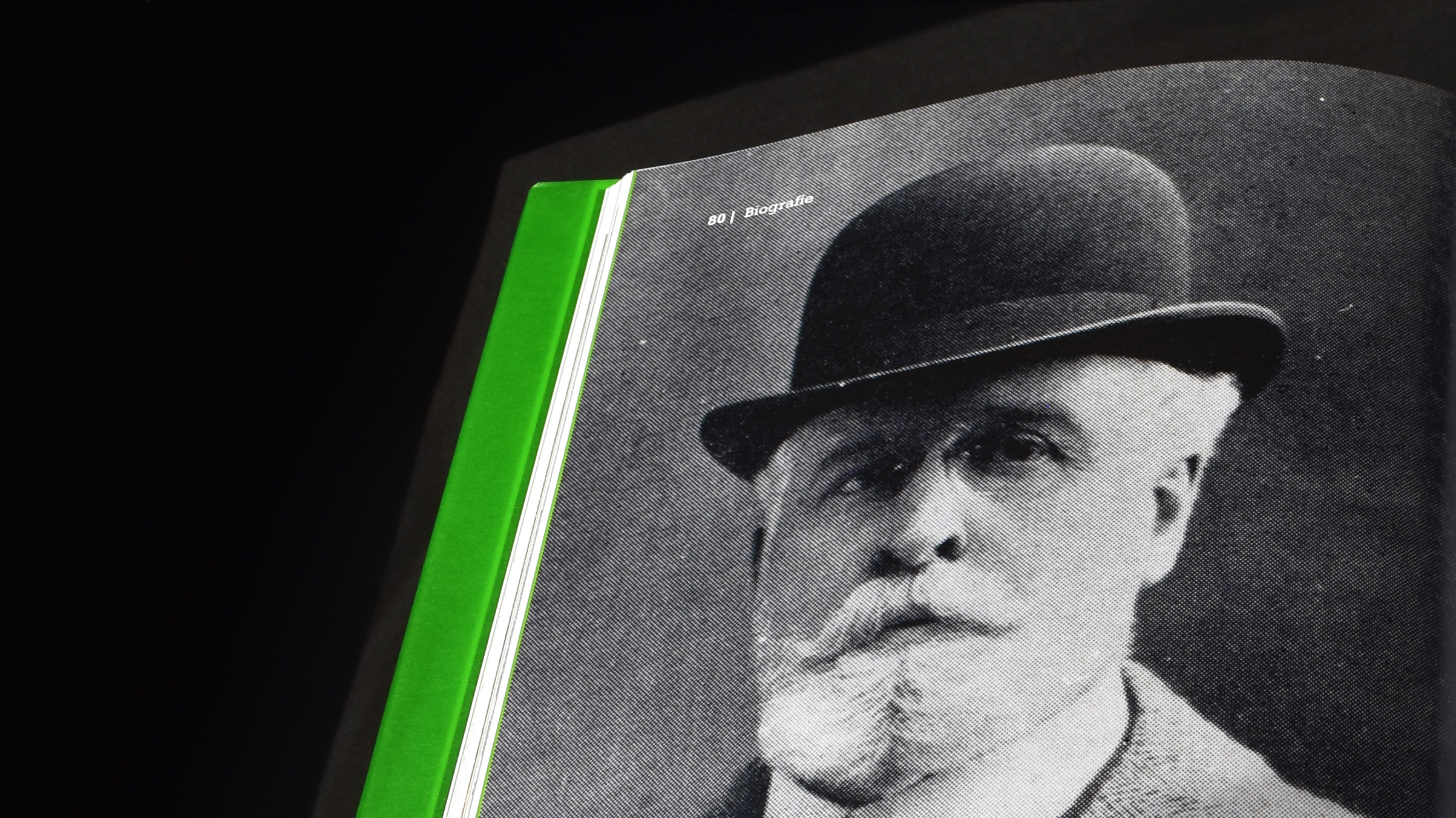
Frank Hinman Pierpont is acknowledged in a separate chapter that deals with his career and typographic work.
Client
University Project
Credits
Celina Hofmann
Michaela Kappes
Katharina Lutz
Year
2020 – 2nd Semester

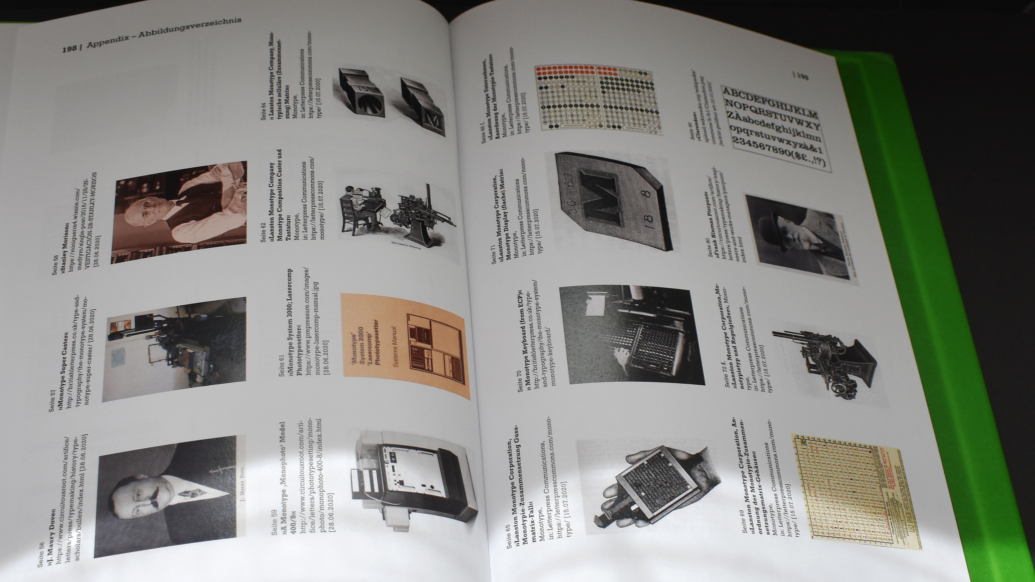
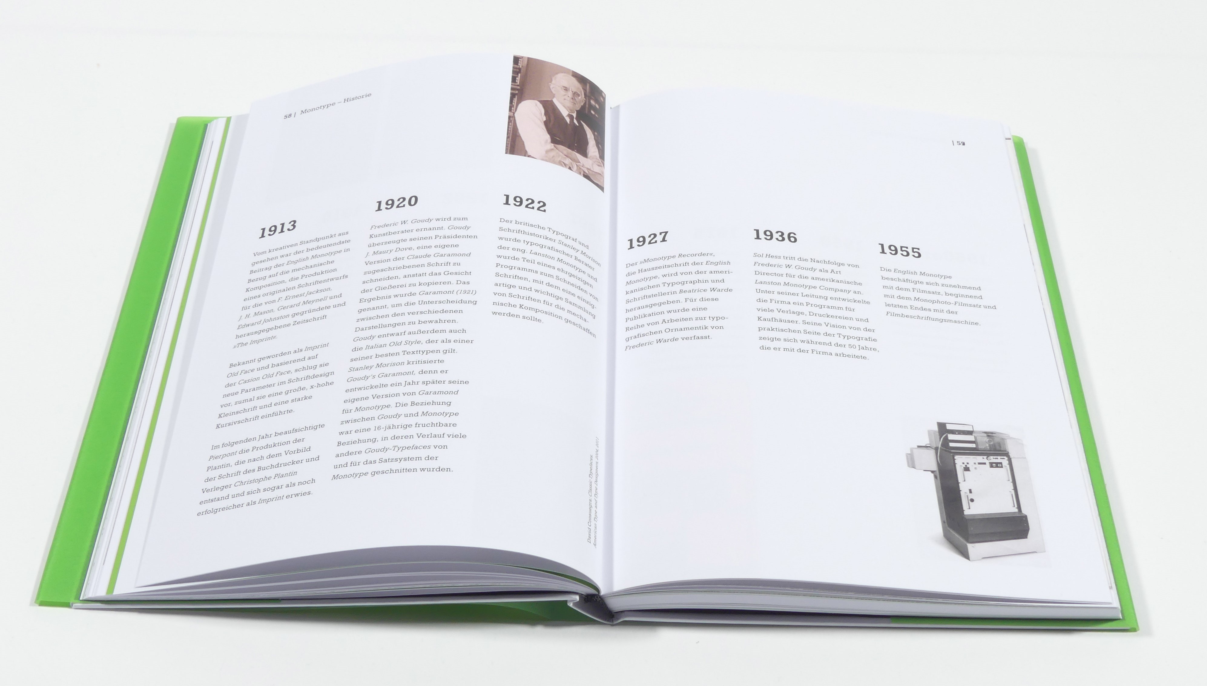
The extensive Monotype history, which is inextricably linked to Rockwell,
is summarised in a timeline, which ensures a quick overview.
Illustrations accompany the bar. It seems important to us that the now obsolete
printing methods and processes of typeface development are illustrated.
solar
lunar